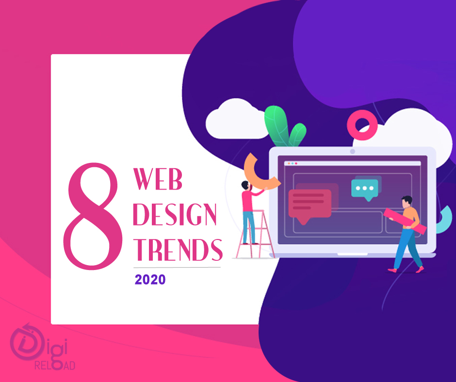
In the last year, we’ve seen advancements in technology that help connect us better with our users, new styles that are pushing the boundaries, and a stronger focus on documentation and accessibility guidelines to make the web a more consistent and accessible environment for everybody.
With so many developments, it’s important to slow down and take a look at what trends will stick around and what new things we can expect to see in 2020. (If you're thinking about a website redesign this year, you've got a lot to consider.)
Here are some of the more notable things we can expect to see in web design in 2020:
Flat Design
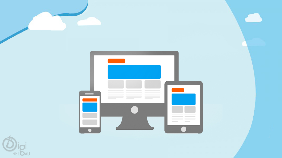
Flat Design is a minimalist design approach that features the use of clean and open space, bright colors, and simple two-dimensional illustrations. This style of design started off as just another trend, but over the years, it’s grown to become the standard for web design. The rise of flat design can be attributed to the need for fast-loading websites that provide users with an enjoyable browsing experience on both mobile and desktop.
Animated GIFs
Today’s user is in an “instant gratification” mindset when it comes to finding the information they’re looking for. That means we only have a small window of time to capture their attention and provide them with what they’re looking for. This is where animated GIFs really shine. GIFs can convey complex ideas in a short period of time while being engaging and entertaining. An added bonus is they also work on most browsers and mobile devices, making them accessible to everyone.
Conversational Bots & Machine Learning
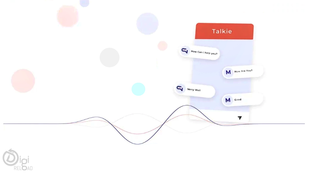
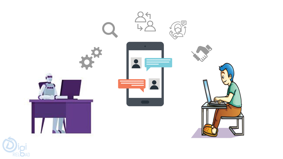
Chatting with bots has become second nature. We’ve seen huge advancements in artificial intelligence and the capabilities of bots. Heck, we see it every day when Google gives us auto-suggestions or when Facebook asks us if we would like to be tagged in a photo.
Many companies are seeing the benefits bots can bring to their organization including Greater convenience by giving users instant responses and filtering them to the appropriate contact based on their issues & improved efficiency by allowing for easier and time-saving transitions between cases.
White Space
White space (also referred to as negative space) is simply the empty space on a page. Think of it as the breathing room around page elements. Using white space to separate the different sections on your pages helps improve readability and makes it easier for users to digest important information. Wealthsimple, an investment app, uses whitespace to break up each section of its site allowing users to focus on one section at a time. It then uses clever animations to direct user eyes down the page.
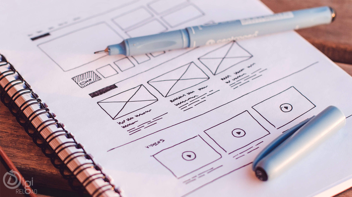
Sketch as the Go-to Web Design Software
Sketch is a software that’s built specifically for web designers and can cover the majority of the design process from creating designs to prototyping to client presentation. Due to Sketch’s powerful open-source library of plugins and its ability to handle so much of the design process, in 2020 more companies will begin to make the switch away from photoshop and move over to using Sketch as their main design software.
Broken Grid & Asymmetrical Layouts
A grid system helps designers maintain alignment and consistency throughout the design and frankly, makes it easier for developers to bring it to life. However, we are beginning to see designers break outside of the standard grid more and more. This helps designers have more creative freedom with their work and create another level of hierarchy on a page.
Creating this extra level of the hierarchy is extremely helpful when it comes to guiding a user’s eyes down a page and pulling them into the most important actionable parts of your site and frankly, it allows for more intriguing and unique designs.
Design Systems
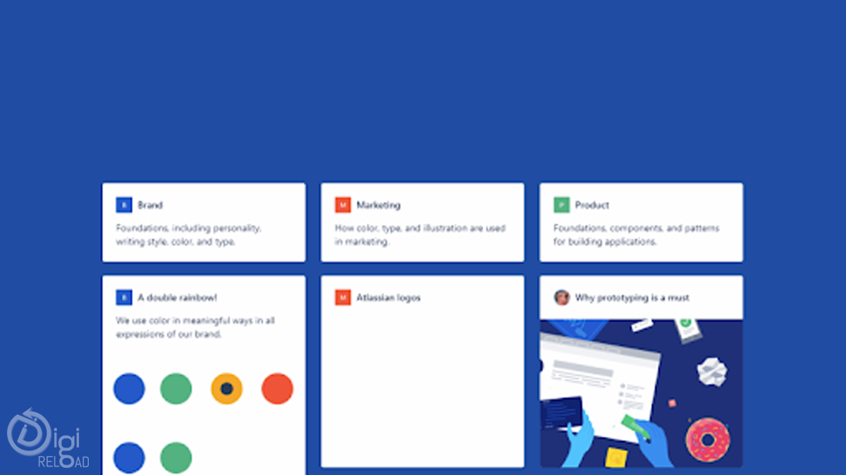
Simply put, a design system is a collection of reusable components guided by a set of rules, constraints, and principles. Over the last year, these systems have become an important piece of many teams. Major companies such as Shopify, Trello, and Airbnb have led the design system charge by building out in-depth systems and even dedicating pages on their sites to them for everyone to see.
The Use of Organic Shapes
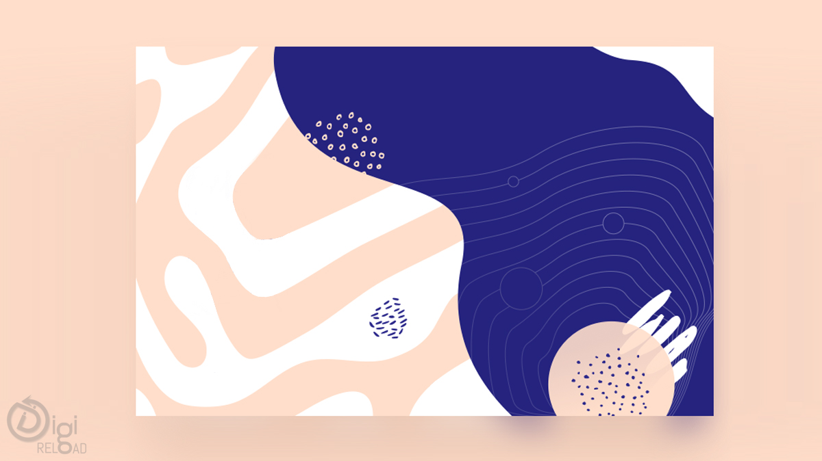
An organic shape is any shape that’s irregular and uneven. In other words, this is a nice way of saying imperfect. They appear more hand-drawn and humanistic. With their unusual appearance, these can be used to grab a user’s attention and add a personable touch to your site. When combined with an illustration or image, they can also really add a nice level of depth to your site, breaking up the monotony of the same circles and squares we’re used to seeing in design.


.png)